Just to demonstrate the basic processes that go into creating these logos, I'll start off with something relatively simple. Much like in other artistic programs, the fundamental tenet behind any composite image is the skillful use of
I shall use my blog's favicon, which has the letters "U" and "C" interlocked with each other, to show how layers are used in Aegisub.
First, I needed my canvass. In order to see any image with blurred edges properly, you need the edges in contrast with the background. If the edges are dark, you will need a light canvass, and vice-versa for light edges. Here I have gone to Video > Use dummy video, where I selected a 640x480 pure black frame to work in. I usually then go to Video > Detach video in order to increase efficiency by making use of my secondary monitor, but one screen is better for these screenshots. Thinking back on it, because favicons are required to be squared off, I could have saved myself the trouble and used a background with a custom square resolution, but working in TV resolutions has become somewhat of a bad habit.
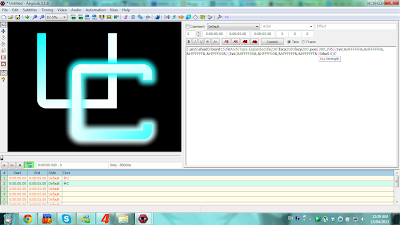
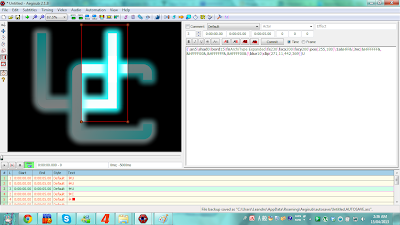
Because this editor primarily assigns subtitles in a chronological manner, if we were to hit Enter after making any changes, thus creating a new line in the process, those new changes would only be visible in a new "frame" of our dummy video, and not overlap with previous changes like we want it to. That's why I selected the first line and copy-pasted it about ten times or so, creating a buffer of lines that were timed to exactly the same frames. This is the first way of how Aegisub can create "layers" of text. That done, I went back to the first line, entered a "U" in the input box, and started to modify it. Within curly brackets before the "U" that designates the area of override tags, I set the AligNment to
for me.
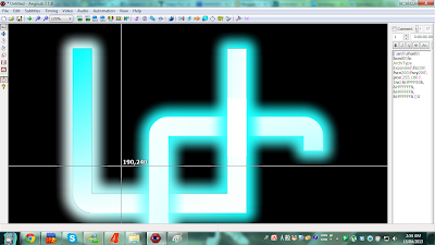
I am quite a stickler for symmetry and whatnot, so I wanted to make sure that my letters weren't placed in a half-hearted fashion. I made sure that the black square made by the overlap of the two letters was placed at the dead center of the frame, here at 320 by 240 pixels. One of the reasons I picked this particular font was because of its nice right angles, and you can see that the corners of each letter fall squarely in the middle of each other. I have made the "C" here using the same parameters as the "U", except in different positions;
\pos(255,180) for the "U" and
\pos(380,295) for the "C".
 |
| 4. Coloring the text |
Time for some much-needed color. I picked a light-blue color scheme for personal preference; mainly because my
favorite character's color scheme is also the same, but also because it is easier to edit in terms of the code used (it's only two digits different from the code for white). First, I changed the C's border width to
\bord15. I then colored it using the Vector Color command "#vc" where "#" designates which part of the text gets colored. "1" is for the main text, "2" is for a secondary color which is not used in designing, "3" is for the border color and "4" is for the shadow color. I wanted the border to be colored in a gradient style here, so I entered
\3vc(&HFFFF00&,&HFFFF00&,&HFFFFFF&,&HFFFFFF&), where the six numbers or letters between "&H" and "&" designate the hexadecimal code for a certain shade of color. "FFFFFF" is pure white while "000000" is pure black. "FFFF00" here is the light blue I was using. The first color listed within the brackets is the color governing the top-left corner of the text; in other words, that color "radiates" outward from that point, mixing with the other colors to create the gradient effect. The succeeding colors are top-right, bottom-left, and bottom-right, in that order. The first two spots are light blue, and the latter two are white, thus creating a light-blue top fading to a white bottom. Likewise, the main body of my "C" gets its bottom-right colored via
\1vc(&HFFFFFF&,&HFFFFFF&,&HFFFFFF&,&HFFFF00&), and the main body of my "U" gets its top-left corner done by using
\1vc(&HFFFF00&,&HFFFFFF&,&HFFFFFF&,&HFFFFFF&). See
here for a better visual representation of this effect; note that this command strictly requires vsfiltermod. I use this command for gradients now instead of the old-fashioned "stripping" method, which uses massive amounts of memory, unless I need gradients using more than two colors vertically or horizontally (which may be detailed in a later post). Finally,
\blur10 performs a Gaussian blur on the borders with a strength of ten gauss; had I used no border, the main body of the letters would have gotten blurred instead.
 |
| 5. "Interlocking" the letters |
And now for the magic trick. In a new line, I inputted a "■" (solid filled square for those who can't see it), which you can do by finding it in a character map or online (or for those with the Japanese IME installed, you can type in しかく, or "sikaku," which means "four-corners" and pick the square through the conversion list). I gave it the parameters
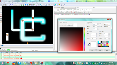
{\an5\fs79\shad0\bord0\1c&HFFFFFF&\pos(385.5,150)\fscy300}, which turns it into a white rectangle that, as you can see from the crosshairs, covers over the middle section of the right part of the "U" as it intersects the "C". I've duplicated it and put it in the bottom left corner so you know what it looks like. You can pick individual colors using the colored "AB" icons on top of the edit box, which correspond from 1c to 4c, in that order. Clicking those buttons gives you that little window on the side, from where you can pick from one of any sixteen million available colors.
 |
| 6. Running into a slight problem |
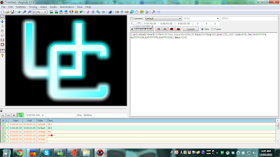
Now for the tricky part. In order to "interlock" the letters, the blurred edge of the "U" has to be consistent throughout its rightmost section where it intersects the "C". I could not add an edge to the "U" in the beginning because it had to be at a different layer than its main body in order for the image to work. This is the second, more direct way Aegisub uses layers. Here I have duplicated the "U" line and put it at layer 0, the bottom most layer. You can see, underneath the call tip saying "Layers" on the top-middle of the screenshot, the little box where you can adjust each line's layer. Also, in the program's bottom-left corner, you can see where it says "#", "L", "Start", "End", "Style", and "Text"; "L" is the column we want, and it lists what number layer each line of code is in. I've arranged the white rectangle to be on top, followed by the "C" line, the initial "U" line, and then the bottom "U" line. For the duplicated "U" line, I've deleted
\1vc(&HFFFF00&,&HFFFFFF&,&HFFFFFF&,&HFFFFFF&), changed
\bord0 to
\bord15, then added
\1a&HFF&\3vc(&HFFFF00&,&HFFFFFF&,&HFFFF00&,&HFFFFFF&)\blur10. The "\1a&HFF&" is there to denote the Alpha, or opacity, layer of the main body text (hence the "1" in front). It is structured much like color codes, being hexadecimal and between "&H" and "&". "00" is 100% visible while "FF" is 100% invisible. I wanted the main body of my duplicate line to be invisible because it would overlap and oversaturate the colors of the original "U" line's main body otherwise. With this, I now have both my letters colored, but it's not quite over yet.
 |
| 7. Clipping the edges, part one. Notice that the right side of the "U" has no border. |
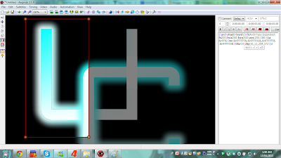
In order to create the illusion of interlocking the letters, I had to clip the duplicated "U" layer using the program's built-in clipping tool. This tool is primarily used for signs in videos that are partially blocked due to something standing in front of it, like a person or another object. The clipping tool is found at the left side of the graphical interface, where the other tools are found; clipping a simple rectangle, in particular, is the sixth tool down. You can then use the mouse to draw a rectangle and adjust it by dragging its corners, much like painting rectangles in other programs. Here, I've applied clipping to the left part of the "U", bringing the right edge of the clipping box right in the middle of and underneath the "C", where the edge remains happily unseen. CLIPping automatically appends the snippet
\clip(61,11,254,372) to the code line, the numbers of which change dynamically as you drag the box's points around, much like positioning does. The numbers are in (x1,y1,x2,y2) format where x1 and y1 are the coordinates of the top-left most point of the rectangle while x2 and y2 are the bottom-right corner's. I'll explain non-rectangular clipping in a future post. Here I've given the box plenty of leg room to accommodate the letter's blurred border.
 |
| 8. Clipping the edges, part two. Notice the different layers. |
To finish the illusion, I duplicated the clipped line to make a third "U" line, but this time I set its layer position to 3, which is in between the white rectangle and the "C" line. I then flipped the clipping to focus on the right side this time, but now, I had to be careful to set the leftmost boundary of the clipping to line up exactly with the rightmost edge of the main body of the "C". If the clipping overlaps with the body, the blurred border of the "U" will show up on top of the "C", ruining the effect. If the clipping does not line up with the edge, the blurred border of the "U" will be visibly disconnected from the blurred edge of the "C". This is what I mean by "pixel perfect accuracy" stated in
my first post. Successful placement of the clipping code, in this case
\clip(271,11,442,369), gives the illusion of overlapping and interlocking letters. However, there's a little cleaning up we have to do before the image is perfect.
 |
| 9. A little housekeeping, before and after. Click to zoom in on these screenshots! |
If you've been following along well enough, you might have noticed that, unlike the "C", there's a tiny dark line at the edge of the main body of the "U" and its blurred border. This happens because of the Alpha, or opacity, function we used earlier on the main bodies of the duplicated "U" lines. For redundancy, this override tag shaves half a pixel off the inside edge of the border. To fix this, I've added a half pixel border on the initial "U" line and colored it white using
\bord0.5\3c&HFFFFFF&. The tiny white line blends in perfectly where the fifteen-pixel external border is white, while it camouflages itself in the main body where the external border is light blue, so the overall size of the "U" remains virtually constant and consistent with the "C".
 |
| 10. Wrapping up. Now try making your own icon or logo! |
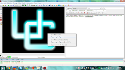
And there we have it. Five lines of code in five layers. This layer-based method of creating this illusion is like, if I had to describe it, making an endless staircase using a kaleidoscope. After deleting the extra buffer lines and saving your work, you can right-click on the completed image and choose to either save a PNG snapshot in a directory you can set in View > Options > Video, or copy the image itself and paste it into another graphics program for further editing if you wish. I pasted mine in Paint (old school, I know) to trim the black at the edges to make it square so I could use it as my favicon. The image is simple, but the process is much more involved, perhaps even quite difficult for beginners. There may be more experienced typesetters out there who could do it better and simpler than I can, but I feel that this exemplifies my "bit by bit" principle quite well; I tried about seven different ways trying to create the illusion, yet none of them worked for me. All in all this took about six hours from start to finish, and all of it required me changing each section, bit by bit, layer by layer, in order to make, as Shrek would call it, an "onion" of an image. I enjoyed crafting this logo, and I hope you've enjoyed watching the process as well.
 |
| Maybe I'll try and combine "MMC," my avatar name, next time? |
Special thanks goes to the makers of
Aegisub for a wonderfully unique program. Kudos to the developers of
vsfiltermod for enabling me to quickly and easily use gradients. The font, again, is
Architype Expanded, a font sold by
Archiness. "UC" being a ubiquitous initial, I am hesitant to claim copyright on it, but if you wish to use this particular image, I will be happy with just a "Thank you" in the comments.


No comments:
Post a Comment